Monday, March 16, 2009

It's FINALLY done (sort of)

Ugggg I gave up on piece # 10 five months ago and then two weeks earlier I picked it up and started it again. And I couldn't do it. So, I destroyed it. And remade it into this.


THE LIGHT DEFRACTOR IS DEFRACTED!!!!!!!

Wednesday, January 14, 2009

follow up


Ostad Ali Asghar Tajvidi is referenced earlier. I like use of color and composition. I guess the main difference between us is that there's a lot going on in his pieces while I just focus on one thing at a time.

Thursday, January 8, 2009

Proof

Refer to blog for understanding. Any work posted before Sept. 23 2008 is to be disregarded with respect to this post. All work posted on or after Sept. 23 2008 is to be given a number: starting with the last piece of the first post (that would be #1) and moving up from there. Any work by artists not myself is to be disregarded.
Pieces 2 and 5 are the basic examples of my theme. #2 has only one colored m and m (which is left up to interpretation) and #6 is a mouse and a mouse. Both of them are small, simply drawn works with an underlying idea.
Numbers 3 and 5 are also small (though took longer than most other works) and are a new way to look at a dollar bill. This also has an underlining idea: what would money do if it had a day off or even what does money o when it’s not being spent.
I also try to use different media (though paper remains constant) and #s 8-10 are examples (#8 is ink and oil pastel, #9 is a cut paper on cardboard, #10 is paper on paper). Though my work does not follow, I do believe that it’s important that every artist be (decently) proficient in every media. It keeps doors open. Numbers 12 and 13 are sad attempts at acrylic painting, but I am happy to have tried. A good artist has failed at everything at least once.
Piece 10 and ½ does not exist yet (which accounts for a major break in posting). I started it as a prism exploding and diffracting light at obscure angles. I spent two weeks on it but it proved to be too stressful and I put it away. Nevertheless it followed an idea: what would happen if a light diffractor was diffracted? It was a good idea and I will begin to finish it soon.

Tuesday, January 6, 2009

Idea of Concentration

I don’t agree with the statement that quantity is better than quality but, there is a simple and prolific aspect to my art. I try to work with more the ideas that the piece causes than the technical skill. Hence a higher quantity. I do a lot of work in pencil but color is our friend. Anything I draw, I usually add an object that is painted or color penciled or glued. Usually this adds to the idea. Teacher tells me to look into some Persian artists. I did. They do some spiraling stuff on smaller planes. The guy Ostad Ali Asghar Tajvidi does good work. But I base my art more on Edward Hopper and Henri Matisse.

Tuesday, December 23, 2008

Monday, December 15, 2008

first acrylic painting in two years

needs some serious touching up, but i think it came out okay.
i'll keep practicing


art in haiku

there will be some work to prove this statement. Coming soon.

My area of concentration is smaller compositions focused more on the ideas that come with the picture than the technical skill of the piece. Valasaraptor

Monday, November 24, 2008

safe


it's been a bad month. I had been working on this super drawing (an exploding prism) but doing it was too stressful. to mellow out i did this one last week.

Friday, October 3, 2008

A Storm In Heaven


this a shot of where Verve's first LP, a storm in heaven, was drawn from. It's a photo.

(guys who do stuff I like) follow up

the works of those guys repectivley


Wednesday, October 1, 2008

some free time

To all diehard Blog fans, this one's for you.


(just cut paper on more paper; it was fun)


(na na na na na na na na na it's a bat, it's a bat, it's a bat)

Tuesday, September 23, 2008

(GUYS WHO DO STUFF I LIKE)

TOP FIVE ART HEROES

5) Winslow Homer- I'm not a fan of his famous works but the really obscure and simple ones he did are really blue.
4) Thomas Moran- I like doing the occasional landscape. This guy is good but sort of repetitive. The landscape Warhol.
3) Franz Marc- The blue silky Fauvist. I'm all about Fauvism and he does it in a jazzy way. Good use of color and movement. Sweet.
2) Frederick Church- A more recent descovery; I don't really know anything about him. Also a landscaper but his work is a lot better than Moran's.
1) Henri Matisee- number one guy; inspirer of most of my stuff. Better than Darin. When he was going blind he started cutting paper and doing art that way. Excellent.

New Art Extranganza

Hey Blog Fans. It's been a pretty unfruitful summer. I have assembled some new work. Moe stuff coming soon.


Wednesday, May 28, 2008

Clay Mug Shot

Here's my progress so far on the clay sculpture. Still needs work. And eyes.


Thursday, May 8, 2008

Nate Chew Err


The sky is awesome.The vivd colors work really well in this one; things get lighter and more yellow the closer they get to the sun; both the clouds and people. The sun's yellow is reflected on the water in the lower left, the coach's top, and the mountains on the right side. On the cattle, you don't quite see the sun's color, but the yellow mixes with their dark red making some kind of orange The painting's genre is classified as Romantiscm, but some people say his art style should be called Luminism.

This is one of my favorite paintings. I didn't know who painted it for a while. It was done by Albert Bierstadt, called "The Oregon Trail" and done in 1867. Oil on canvas, 31 X 49." Alby looks like a mix of Chester Allen Arthur and Santa Claus.

Attack of the Clay People

Clay is my natural enemy.


Finished this one in record time; 3 days. Last clay thing I did took me like 40 days (seriousy, and it was only a shoe).

Tuesday, May 6, 2008

Ball Loons

I made the "sculpture" and then drew it.


Wednesday, April 9, 2008

Spirit Space


The ripples on the water are done incredibly well. They have texture and reflect the back mountains, the boat, and fisherman. Nice Homer, naice. You can't see the source of light at first and there are also no shadows that identify anything plus the sky is pretty gray. But, if you look at the water, you can see the reflection of the sun in the bottom right corner. What's weird is the sky about two thirds of the way up. it seems to mirror itself.

The Red Canoe by Winslow Homer, 1889. No website would give me the medium (apparently MET has better things do upload), presumably oil on canvas, 18 x 25
Here's Winnie:

Thursday, April 3, 2008

Powa' and Authoritay

This painting has two balanced focal points: the tree thing in the lower right and the mountain in the upper left. Purple skies and light blue clouds gives this painting a cool color scale. Plus the mountains are brown; my old art teacher at kenmore had a Thomas Moran poster that said MOUNTAINS ARE NOT BROWN. This is a landscape painting.
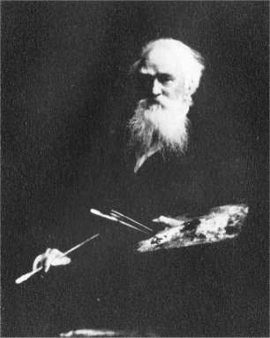
This one was done by thomas moran (Index Peak, Yellowstone National Park, 1914, oil on canvas, 20 x 30 1/4 inches). Tommy looks like this: